import xarray as xr
import pandas as pd
import numpy as np
import urllib.request

from matplotlib import pyplot as plt
from matplotlib.colors import LinearSegmentedColormap
import warnings
#warnings.filterwarnings('ignore')Summary
This example is based on the OceanWatch tutorial meterial edited with Great Lakes satellite data.In this example you will see how to extract Great Lakes ice concentration data from the ERDDAP server and make a ice concentration map, and caculate the monthly
The example demonstrates the following techniques:
- Loading Great Lakes ice concentration data from Great Lakes ERDDAP data server.
- Create a map of ice concentration.
- Compute the daily mean over the selected region.
Datesets used:
- Great Lakes ice concentration: Great Lakes ice concentration product.
Import the required Python modules
Downlading data from ERDDAP server
Because ERDDAP includes RESTful services, you can download data listed on any ERDDAP platform from Python using the URL structure. For example, the following link allows you to subset daily ice concentration data from the dataset GL_Ice_Concentration_GCS
In this specific example, we will get the SST data from 2023-06-01 to 2023-06-30. the URL we generated is :
https://apps.glerl.noaa.gov/erddap/griddap/GL_Ice_Concentration_GCS.nc?ice_concentration%5B(1995-01-01T12:00:00Z):1:(2024-05-01T12:00:00Z)%5D%5B(41.38):1:(42.10)%5D%5B(-83.59):1:(-82.5)%5D
we extract the data in csv format due to the nc library not available.
url="https://apps.glerl.noaa.gov/erddap/griddap/GL_Ice_Concentration_GCS.nc?ice_concentration%5B(1995-01-01T12:00:00Z):1:(2024-05-01T12:00:00Z)%5D%5B(41.38):1:(42.10)%5D%5B(-83.59):1:(-82.5)%5D"
urllib.request.urlretrieve(url, "w_e_ice_concentration.nc")
Importing NetCDF4 data in Python
Now that we’ve downloaded the data locally, we can import it and extract our variables of interest.
The xarray package makes it very convenient to work with NetCDF files. Documentation is available here: http://xarray.pydata.org/en/stable/why-xarray.html
import xarray as xr
import netCDF4 as nc
Open the file and load it as an xarray dataset:
ds = xr.open_dataset('w_e_ice_concentration.nc',decode_cf=False)
#ds = xr.open_dataset('e_sst.nc')
Examine the data structure:
dsExamine which coordinates and variables are included in the dataset:
ds.dimsds.coordsds.data_varsds.attrsExamine the structure of ice concentration:
ds.ice_concentration.shapeOur dataset is a 3-D array with 52 rows corresponding to latitudes and 79 columns corresponding to longitudes, for each of the 7146 time steps. #### Get the dates for each time step:
ds.timeds.time.attrsprint(ds.time)The time units is seconds, we need to convert the seconds to dates.
dates=nc.num2date(ds.time,ds.time.units,only_use_cftime_datetimes=False,
                        only_use_python_datetimes=True )
dates
Find the index of dates for 2019-03-01
for i, date in enumerate(dates):
    if date.strftime("%Y-%m-%d") == "2019-03-01":
        print(i, date)
5872 is the index on the array dates for 2019-03-01.
Create a map of ice concentration for March 1, 2019 (our 5872th time step).
import pandas as pd
import numpy as np
from matplotlib import pyplot as plt
from matplotlib.colors import LinearSegmentedColormap
#np.warnings.filterwarnings('ignore')
#### Examine the values of ice concentration:
print(ds.ice_concentration.values)
print(ds.ice_concentration.shape)ds.ice_concentration.attrsds.ice_concentration.attrs['_FillValue']Make a new ice concentration DataArray and replace _fillValue with NaN
nan_ice_concentration = ds.ice_concentration.where(ds.ice_concentration.values != ds.ice_concentration.attrs['_FillValue'])

print(nan_ice_concentration)
Set some color breaks
# find min value in man_sst
np.nanmin(nan_ice_concentration)np.nanmax(nan_ice_concentration)levs = np.arange(0, 101, 10)
len(levs)Define a color palette
# init a color list
jet=["blue", "#007FFF", "cyan","#7FFF7F", "yellow", "#FF7F00", "red", "#7F0000"]
Set color scale using the jet palette
cm = LinearSegmentedColormap.from_list('my_jet', jet, N=len(levs))plot the ice_concentration map
plt.subplots(figsize=(10, 5))

#plot 5872th ice concentration image: nan_ice_concentration[5872 ,:,:]
plt.contourf(nan_ice_concentration.longitude, nan_ice_concentration.latitude, nan_ice_concentration[5872,:,:], levs,cmap=cm)

#plot the color scale
plt.colorbar()

#example of how to add points to the map
#plt.scatter(np.linspace(-82,-80.5,num=4),np.repeat(42,4),c='black')

#example of how to add a contour line
#step = np.arange(9,26, 1)

#plt.contour(ds.longitude, ds.latitude, ds.sst[0,:,:],levels=step,linewidths=1)

#plot title
plt.title("West Lake Erie Ice Concentration - " + dates[5872].strftime('%b %d, %Y'))
plt.show()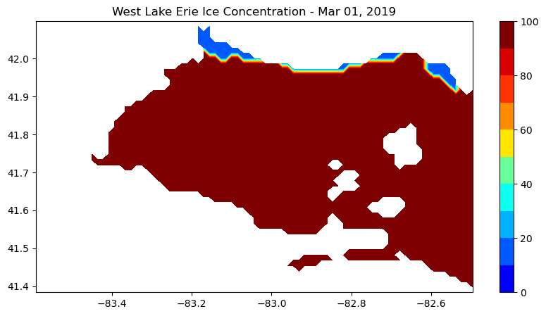
Let’s compute the daily mean over the west Lake Erie region:
res=np.nanmean(nan_ice_concentration,axis=(1,2))
res
Let’s plot the time-series (from 2019-03-01 to 2019-03-31):
for i, date in enumerate(dates):
    if date.strftime("%Y-%m-%d") == "2019-03-01":
        print(i, date)

    if date.strftime("%Y-%m-%d") == "2019-03-31":
print(i, date)print(res.shape)plt.figure(figsize=(8,4))
plt.scatter(dates[5872:5902+1],res[5872:5902+1])
#degree_sign = u"\N{DEGREE SIGN}"
plt.ylabel('Ice Concentration (%)')
plt.xlim(dates[5872], dates[5902+1])
plt.xticks(dates[5872:5902+1],rotation=70, fontsize=10 )
plt.show()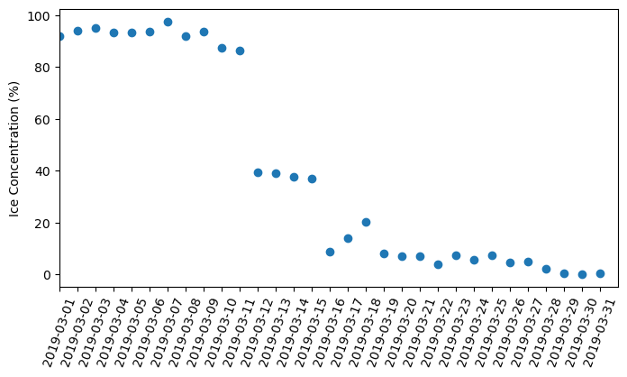
!jupyter nbconvert --to html GL_python_tutorial4.ipynb